About
About | Authors | Site History
What is this website?
Hi. I’m Ansel, and I’m not the primary writer of the content on the site. Nice to meet you.
I’m the webmaster. Though, Tolly made the site for me… I had some thoughts about Japanese horror films that I wanted to share, so he made this website for—
[Tolly] Seal it, Ansel. I wanted my own personal website as an independent artist.
[Ansel] Sure, but you were never really that enthusiastic about drawing porn, even the porn that you liked, and you were more concerned about me having a place to talk intelligently about Japanese horror films. You even created all the site assets with me in mind and lent me the time to learn modern CSS.
You didn’t have to do that.
[Tolly] …
[Ansel] …Well, this site is our place, I guess. Expect a lot of art reviews and the occasional dick drawn by Tolly. He’s not even that interested in drawing bara and shounen ai, even though that’s ostensibly why he wanted a website.
The personal lends itself to the social.
I was born in 1995. The World Wide Web, or as I liked to call it, the World Wild Web, was a magical, anarchic space. Neopets and Lissa were teaching kids (this one included) how to write HTML. You had websites about anything, by anyone: resources on Soviet Literature, scanlation groups, personal havens for pets both real and virtual, joke vendors of human meat. Everyone was part of a webring, and had their own mini affiliate banners. Webmasters made multiple banners so you could pick one that best fit the aesthetic of your site.

What you see here is art.
Then Facebook came, and Twitter did too, and instead of actively searching for content you wanted and manually typing in websites into your address bar (assuming you didn’t have them bookmarked), you just—
Scrolled. Passively through a feed. You were being fed. On the off-chance you’d find something interesting.
Ads, ads, more ads—but maybe there was something interesting. And you Liked and Followed the Facebook pages of all the previous sites you had previously gone to directly, so surely you’d see it in your feed. Eventually. Nah, it’s just your racist aunt going on about the blacks again. More ads for a cake shop 40 miles from your house… (You stopped browsing 4chan for this?)
Oh, a funny cat video.
Like.
And there goes 30 minutes of your life.
Wherein we explain the social media wasteland that drove us to seek the refuge of the personal website.
(Yes, nostalgia played a part too, but that wasn’t the only thing.)

Click on the image to view it in full.
You stopped checking forums and posting on them. You stopped visiting the blogs in your bookmarks. You stopped making your own websites, stopped sitting down to think and write, and you started crafting digestible Facebook posts and Twitter tweets with the hashtags you thought would boost “user engagement” (what the hell does that mean?) the most. You stopped surfing the World Wide Web, and started being the bitch on booty-call for the Notifications counter.
Now, it wasn’t all that pretty back when the World Wide Web was truly wild, that’s true. We had our own version of the endlessly scrolling page that never let you navigate back or forward: it was called the <iframe> and anyone who used it deserved to be brought before a firing squad. Usability was a nightmare, and many websites were not designed with the disabled in mind. And when Flash came along, things just got worse; suddenly everyone wanted to make their own website in Flash (not that they could; and thank fuck for that). So you just didn’t have any webpages to refer back to, and neither did the search engines.
But they were still cool. And people were still making things.
Ansel: That macaroni and cheese yellow of the navbar is forever burned into my psyche as “Neopets yellow”. The modern site design doesn’t have that light olive drab, and the homepage no longer has a sidebar dedicated to the News. Instead, right under your active neopet, is a dedicated Facebook “Like” button…
Tolly: One of our favourite things to do on Neopets was playing user-created Choose-Your-Own-Adventure games (the Neopian Adventure Generator). We even tried our hand at making our own, but I can’t remember what it was about…

Click on the image to view it in full.
I miss the time when websites felt like actual places, spaces with unique identities, with forms that were just as important, just as affecting as the content themselves. Nowadays you can make a Carrd or a Squarespace and just load your images into predefined containers (most often rectangles—that scale to fit mobile devices! important!) and, it is convenient. But you could replace any and all of the content without ever being hit by the aesthetic and cognitive dissonance of substituting your website’s content with something totally alien.
Just look at the website below. Now, I could replace all the stills with screenshots from SpongeBob SquarePants: Battle for Bikini Bottom – Rehydrated, or videos of Cardi B twerking, but it’d be weird. People would want to ask if everything were OK at home, if I needed someone to talk to. I’d be at a loss to explain how the Krusty Krab or Gangsta Bitch Music, Vol. 1 had anything to do with a fantastic and classy steampunk aesthetic.
Tolly: Ishkur’s guide is still up, with a revamped design that includes music samples you can listen to.
Ansel: If you have any sort of fucking musical taste you’ll go to that site, now.

Click on the image to view it in full.
I didn’t just want a place where I—we, Tolly and I—could just post our thoughts. We could turn to Facebook for that—and frankly, the validation we’d get from our socialist Facebook friends would give us such a high you wouldn’t believe.
[Tolly] But we didn’t just want an Internet receptacle to dump our thoughts. We wanted our own place, somewhere that would be by us, for us, made of the things we liked, with shapes and textures and warmth and cornflower blue, and oxidised green. And metal, and sand, and stone, and wood… Something of the New Mexico landscape that Ansel had fallen in love with. Something with Pueblo Deco architecture. Something that was a monument to the fable I treasured the most.
When you fill out your Facebook page, or your Twitter profile, or your Instagram bio… You try to make yourself appear a certain way, attempt to come off as witty perhaps, whatever it is, you try to make yourself look “good” or “appealing”, certainly. But for all the effort you've put into it, there isn't an ounce of love, is there?
And you will never build the sense of fondness and nostalgia for a white, sterile, cookiecutter Facebook page as you will for a lovingly crafted website.
Tolly: Our site’s design is heavily inspired by Langmaor’s. I loved how dark it was… It felt classy, and sophisticated, with an art deco navbar on the homepage that lit up and made you feel like you were in the elevator of an art deco building.

The balloons of “Cool Stuff” always excited me. And look at how the “Help” section is visually indicated. An ambulance! How cute!
Click on the image to view it in full.
Websites are art. Or, they can be art. Form is just as important as the content it encapsulates. What kind of forms can you build on a Facebook page? A Tumblr? Those platforms are built with marketing and brands in mind, not art, culture, education, or creative expression.
What’s more, you’re severely restricted not only in form, but also in content—erotica and NSFW content are always the first to target by moral guardians—but the real heavyweights in those cases are advertisers and businesses seeking to reach the “broadest possible consumer base”. And then comes the political censorship…
Look, do you think WikiLeaks could have made any social media platform their primary publishing avenue? For all the talk of “building global community”—one that is “informed” and “building the world we want”—these companies have been involved in the most concerted state efforts to censor left-wing politics, whilst letting Nazis run amok on their platforms (and the state letting Nazis run amok in the streets).
[Ansel] Whether you just want to publish kinky porn, either as a hobby or as a means to support yourself, or you want to help bring about world socialist revolution—you’re fucked. And not in the fun, sexy way.
Ansel: I used to check this site weekly, or even daily. Nowadays, modern sites for games are heavily reliant on CSS and Javascript that make backgrounds videos and movable images that span the whole width of the viewport. And other sites simply let a single hero image do all the work.
The website design of The Sims 2 felt like something out of the game itself, obeying the aesthetic standards set by the GUI.

“A mystery on the DS.”
Maybe you can see some of Hotel Dusk’s influence on this site…
Websites can make lasting, invaluable impacts both on the personal and the social level. And the tools we have to make them have come so far. We have HTML5, which supersedes our beloved Flash and can be integrated with WebGL to create 3D objects and environments, we have open-source frameworks like Bootstrap to build websites usable for any device, we have services like JSFiddle that make real-time collaborative webdesign possible. This medium—and the Internet as a whole—has more potential than it ever has before.
We couldn’t take it anymore. We just had to do something.
Finally, we get to share our porn.
[Tolly] And an appreciation of classical Russian literature and Soviet film. Side-by-side.
[Ansel] Side-by-side.
Ansel: I have nothing to say about the design of this site.
Tolly: Awww, he’s shy.
Design philosophy
So now you know why we wanted to make a website: to share amazon porn and classical Russian literature. But what about how we wanted to make a website?
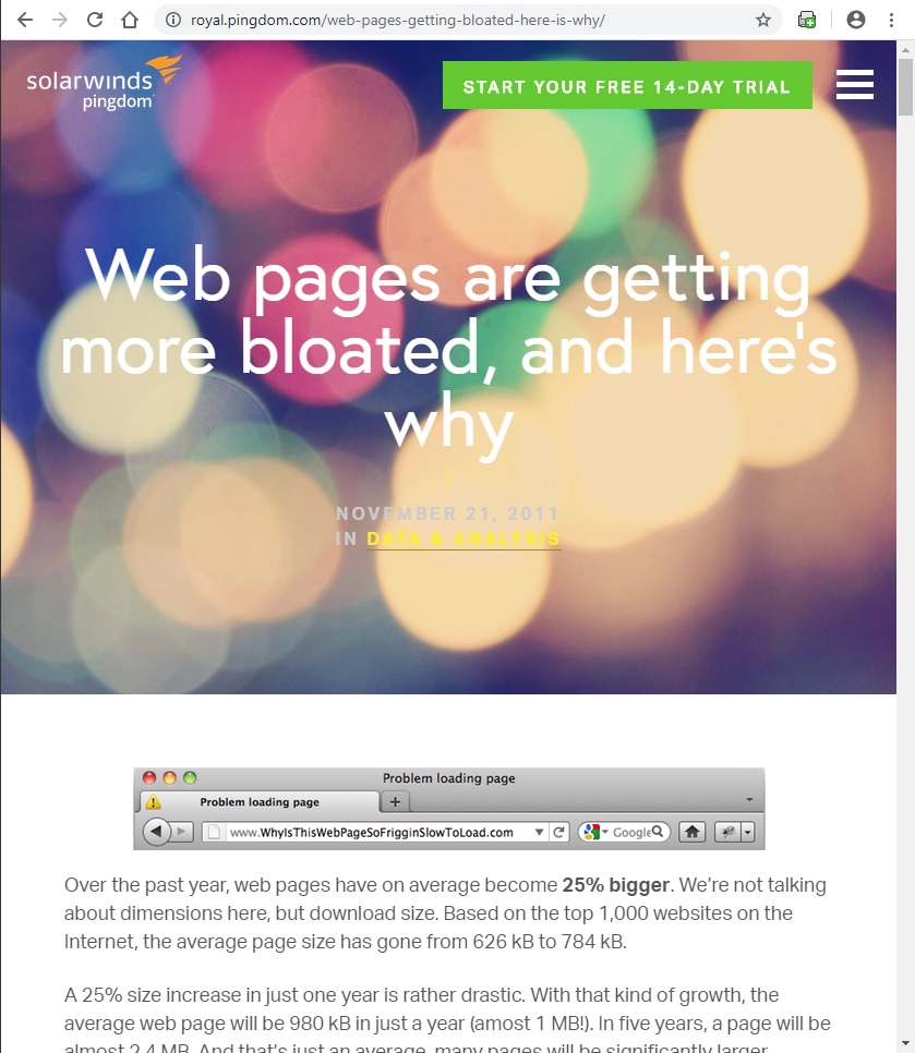
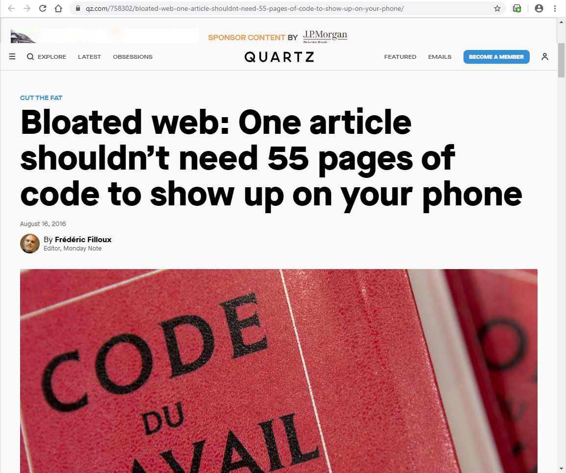
Modern websites are a bit like bloated corpses: rotting insides, bloated and heavy with gas, and not all that pretty to look at. Sprawling CSS, heavy reliance on JavaScript, requests from multiple servers to render invasive advertisements and chum boxes, massive graphical assets and no thumbnails. I’m looking at you, useless hero images and videos. Look at this abomination. Big-ass image of blurry lights for what? Can barely read any of the white and yellow text on that goddamn hero image. Why?
But it’s not just the bloat that bothers me. It’s the lack of a concise and aware design mentality. What the fuck does an essay on website bloat need a photo of Christmas lights for? Does everything need a massive hero image? One that takes over half the viewport, never mind a header font size that makes the headline hard to read?
Call it what you want: fluff, useless bullshit, cancer. Even if your high speed, fibre-optic Internet connection can load poorly coded advertisements from a third-party network in .0000008 milliseconds, the designers of these websites have NO respect for the user’s time, agency, or intelligence. They forget that the Internet is an interactive medium, built on hypertext, curiosity, information density, and amazing tangents.
So, what were our objectives?
Lean visuals: Visual content must support the content. Found a nice big photo relevant to the subject at hand? Crop out any extraneous parts. The article doesn’t need them. It doesn’t need that whole photo, unless it does.
Feedback: The Internet is, or at least used to be, an interactive medium. You know what webpages can do that static text can’t? We can hover over things. Links should be immediately obvious to the user; when the cursor hovers over a link, the link must indicate to the user that it is clickable; when clicked, the link must indicate that it’s been activated; if the user has previously visited that linked page, the link must indicate so. Images that can be expanded must have a caption indicating so, and they must be highlighted upon being hovered over.
Information density: You have space. Use it to convey information as accessibly and as efficiently as possible. The right secondary column can be used for annotations. In-line images must be captioned with appropriate descriptions or commentary. Use hyperlinks to introduce new and relevant content to the users.
Ease of navigation: Thematic breaks in content and other sections should have anchors that allow the user to navigate back to the top of the page or section quickly and easily. On desktop/tablet displays, the navbar should be always present and accessible; don’t force the user to scroll all the way up just to get to a different part of the website.
Organised typography: All text should be legible: no light grey text on white, no painfully thin typefaces that cause eyestrain. All forms should be immediately grasped by the user. Colour should indicate hierarchy of elements: headers and subheaders, pull quotes, anchor links, speaker shifts.
Overview of the practical principles we followed when designing the website.
Review ★ Ratings
★★★★ Monumental cultural work
★★★☆ Highly recommended
★★☆☆ Limited recommendation
★☆☆☆ Very flawed
☆☆☆☆ A complete waste of your time
Note that we can like or even enjoy very flawed things without actually recommending people subject themselves to it, e.g. Resident Evil: Vendetta. For us that’s foreplay. Still an embarrassment of a film.
How do you build a website like this?
Well, you’re here, so chances are, you already know what Neocities is. And if you’re like me, a ’90s and early ‘00s Internet nerd, you already know how to make websites with tables. And in fact, there are still useful tutorials on how to do so.
Don’t do that. For the love of god, don’t do that. We may carry the zeitgeist of 1999 in our hearts but it’s been well over two decades since then, and browsers have changed. Tables don’t work the same way they used to.
This is a long subject that requires and deserves its own page, nay, several pages to cover. Which I will make when I have the time. In the mean time, you should really check out the web design resources I’ve posted on the Links page.
Tutorials will be posted here eventually.
Who are you?
(You can read more about the authors here.)
[Ansel] I’m Ansel.
[Tolly] And I’m Anatolij.
[Ansel] That’s… basically it, really.
[Iseul] They want to know more about you personally you fools
[Ansel] How the fuck did you get here? Why are you here?
[Tolly] Oh, I see! Ansel, we should post personals on this page.
[Ansel] No.
Anatolij Janáček
I enjoy potatoes, books, cheese, crab, pork, eggs, and tuna. The quickest way to my heart is through my stomach. And in case you haven’t noticed already, I’m a Trotskyist.
The Scorpion of Baldora Field
“Huh? What is that fire?”
“That’s the Flame of Scorpio. …It’s a scorpion that burnt to death. The flame was so hot, that it still burns to this day.”
“Scorpions are really bad bugs! My teacher told me that… they’ll try to sting you with their tail and you can die!”
“That’s true, but scorpions aren’t bad. Our father told us once about the scorpion of Baldora Field. The scorpion killed smaller insects and ate them. Then one day, a weasel found him. The scorpion fled, and fell into a deep well.
“He thought to himself, ‘Ahh, how often have l eaten other creatures? And now, the one time that l was the prey, l fled in utter terror. And look what came of that. I'll die in this well, alone.
‘Ahh… Life is filled with uncertainty. Why, I could have given the weasel another day of life with my sacrifice. But now… my death will help no one. I am useless.
‘Dear Lord, I beg of you, look into my heart and hear my prayer. In my next life, don't let me waste myself. Let me use my body for the true happiness of everyone in the world.’
“And then, the scorpion burst into flame, a brilliant crimson glow. And by the light of his burning body, he lit up the night forever.”
Whilst maintaining the light, the lamp is lost.
“I vow to be like that scorpion. …Campanella. No matter where I go, we’ll always be together.”
The Little Prince’s fox
“My life is very monotonous,” the fox said. “I hunt chickens; men hunt me. All the chickens are just alike, and all the men are just alike. And, in consequence, I am a little bored. But if you tame me, it will be as if the sun came to shine on my life. I shall know the sound of a step that will be different from all the others. Other steps send me hurrying back underneath the ground. Yours will call me, like music, out of my burrow. And then look: you see the grain-fields down yonder? I do not eat bread. Wheat is of no use to me. The wheat fields have nothing to say to me. And that is sad. But you have hair that is the colour of gold. Think how wonderful that will be when you have tamed me! The grain, which is also golden, will bring me back the thought of you. And I shall love to listen to the wind in the wheat…”